Shipping the Women in Tech SEO page builder
Learn how Spaces & Tabs built the new Women in Tech SEO website as a drag-and-drop page builder using Sanity and Astro.
Last updated: 15 June 2024
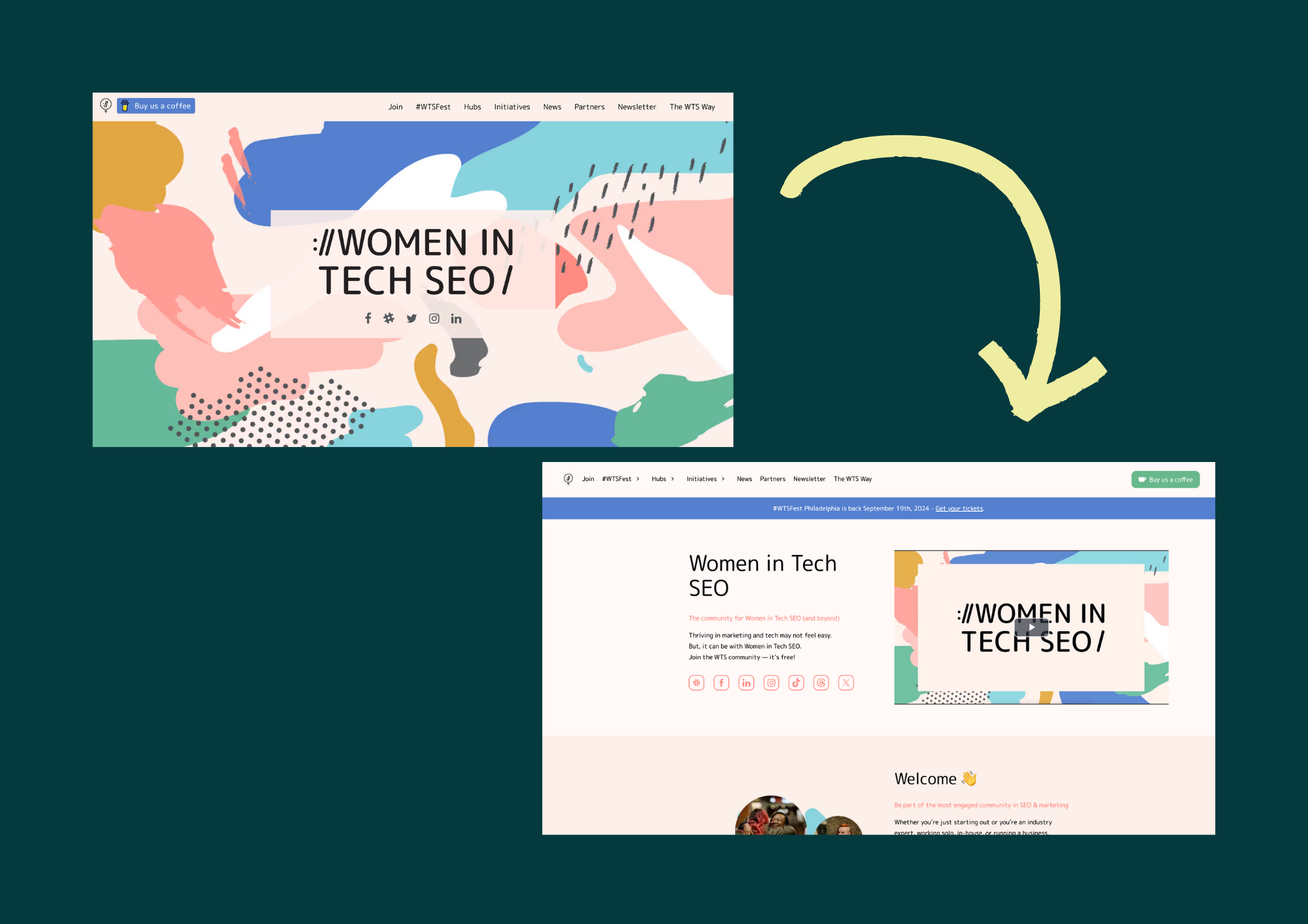
Old (top) vs New (bottom)
The first Women in Tech SEO website started as simple blog website to feature some blog pieces written by Areej and highlight upcoming local meetups.
It grew to have interactive pages like Speakers hub and Founders hub and featured more initiatives as Areej grew the community..
The community needed a fresh website that can scale with the growth of the community. A grounds-up project with the aim of building a flexible content editing experience that allows editors to get creative in the way initiatives are the presented.
Rethinking the CMS schema
The old version of the website relied on an inflexible schema that mapped 1-to-1 with templates.
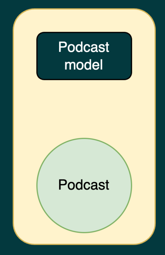
Sample of the old content schema
This graphic is a simplified example where you can see that for a "Podcast page", the content schema had a backing "Podcast model" schema. This extended to other parts of the website so "Blog page" had a "Blog model, "News page" had a "News model"...etc.
The problem is the duplication this rigid structure introduces. Both Podcast and Blog had long-form text. The only difference was that Podcast had an additional embed for the audio player so why do we need to duplicate the long-form text definition in two different schemas?
It also became expensive to manage. The website was using Contentful and they recently changed their pricing and limited the free tier to 25 models. Otherwise WTS would've to pay $300 USD a month.
We can definitely do better.
Most marketing websites, including majority of Women in Tech SEO, is actually build as sections. No matter how you structure the content, the website will always render something similar to:
<html>
  <head></head>
  <body>
    <section>...</section>
    <section>...</section>
    <section>...</section>
  </body>
</html>
So why not make the content model in the same way the website is rendered. It sounds familiar because it is. Every website builder like squarespace works like that.
We worked with an excellent designer who helped split the website into UI components and then recreated existing templates with as a collection of UI components.
These UI components are what shaped the content schema and templates became a content editing concept instead of a content management concept.
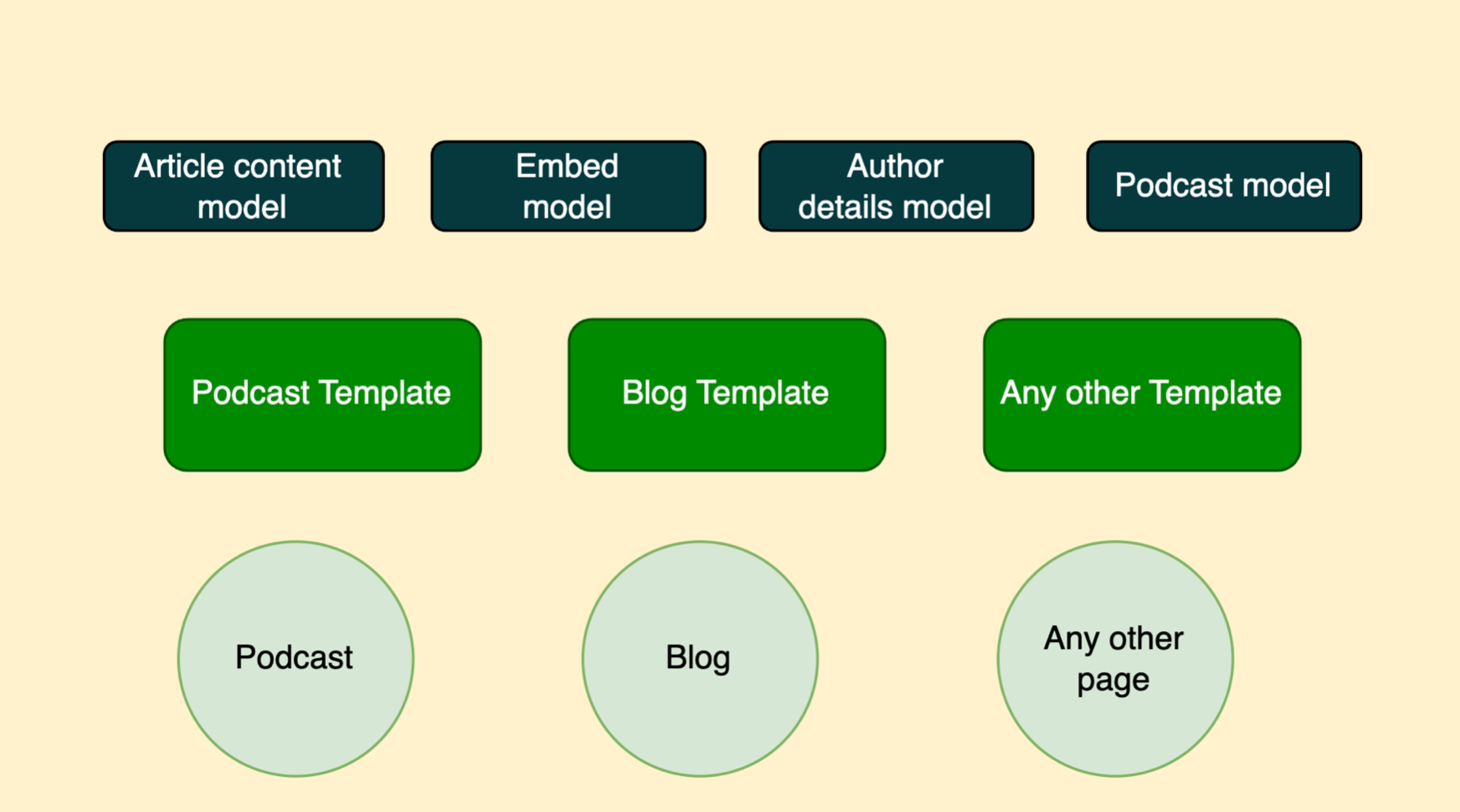
Sample of the new content schema
The result is roughly represented in the illustration where a template is just a stack of these UI component models, highlighted in dark blue, to render.
Choosing the right tools
If you are starting a marketing website right now, Astro is a strong candidate to use as your web framework. It's main selling point for us is that we don't have to use a UI frameworks.
Most the website only needed HTML, CSS and a little bit of JS. We don't need the interactivity that React and Vue bring but the good thing in Astro is that we can add them whenever needed.
Picking Astro was an easy decision but picking a content management system was harder. The project needed a system that's customisable and flexible, with a good content structure management, a generous free tier and a performant API.
Sanity hit all these criteria.
The content structure lives near the code in schema files which makes development of the UI components easier and tracked in same manner code changes are.
It has an editor, Sanity Studio, that is very customisable and flexible. The studio supported our concept of building templates out of UI components instead of having to prepare the content schema for them. Draft previews are supported with minimal configuration. All these made Sanity a great fit for the new WTS website.
Thoughts on the new schema
Sanity allows you to specify your content models through JSON and Sanity Studio takes care of displaying the forms and input fields required to fulfil your schema.
These forms and input fields are the main behavioural contract between content editors and the website's rendering logic. It's our responsibility to ensure that this contract is fulfilled by following a few guiding principles.
Use and enforce validation rules
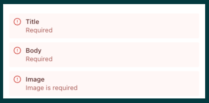
Validation example
Each field in the sanity schema can be validated and when building its definition we have to consider its uses. For example, if it cannot be empty or skipped then we make it required. This makes content editing easier to reason with and reduced ambiguous or undefined behaviour.
Be descriptive
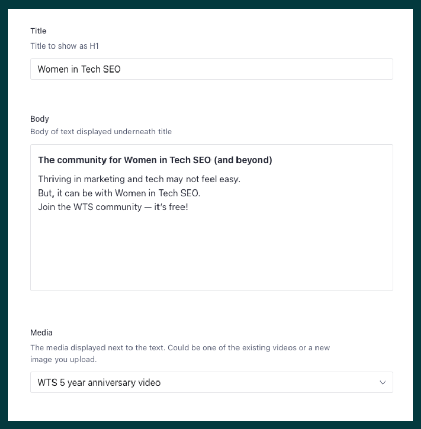
Example of a Sanity form for a UI component
Fields have a name, title and description. Use them all to indicate what is the role for each field. It's another tools to reduce or eliminate unknowns when editing or creating content.
Display relevant data

Example of a preview component
When editing content, we want to be able to know which UI component is being used and preview its content and when defining a schema we made sure to customise how Sanity displays it in previews.
Use free form input only for content
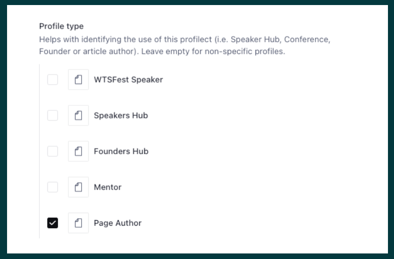
Example of using checkboxes instead of free-form text
When a field only has a set of accepted values, we rely on drop-down menus, checkboxes or radio buttons to make sure that content editors use an accepted value. This makes you trust the data you are getting, provides clarity to everyone involved and reduces complexity of developing a given component.
Rendering optimisation
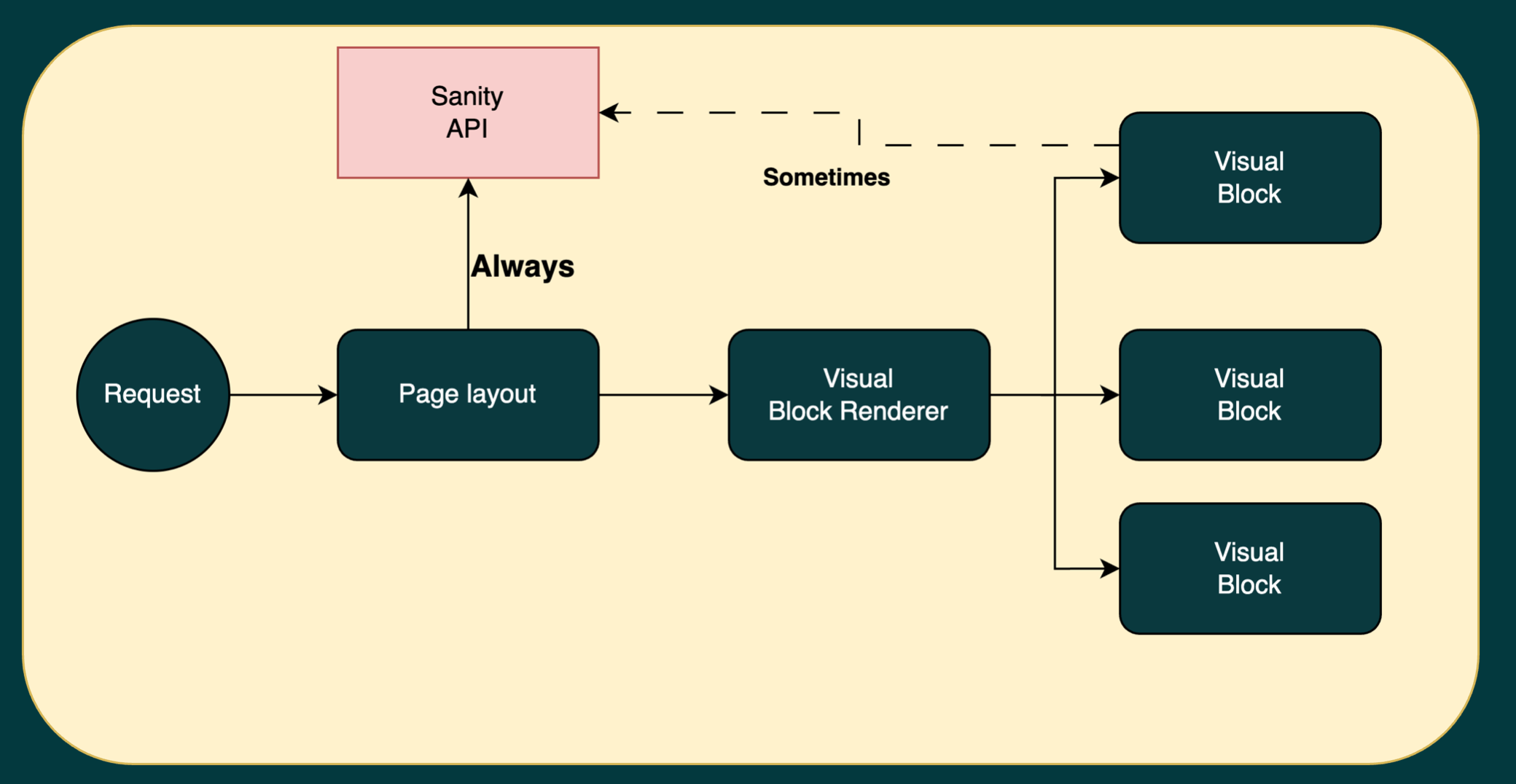
How a request is handled in the new WTS website
Cutting out templates from the content schema meant that the website code also didn't need to worry about the concept of templates.
Instead the website's logic is only concerned with checking if a page exists and fetching which UI components it should render.
Each request is served by a route that calls the Sanity API to fetch the page's UI data and hand it over to a rendering engine which takes care of rendering the individual UI component.
Components can also recursively call the rendering engine to handle any references to other components. This ensures that each UI element is rendered in isolation and helps us unintentionally linking to different elements together.
This flow also ensures that in most cases, the website is calling the Sanity CDN once per request. We only make subsequent requests whenever a UI component is resolving references to other components.
What's next for the WTS website
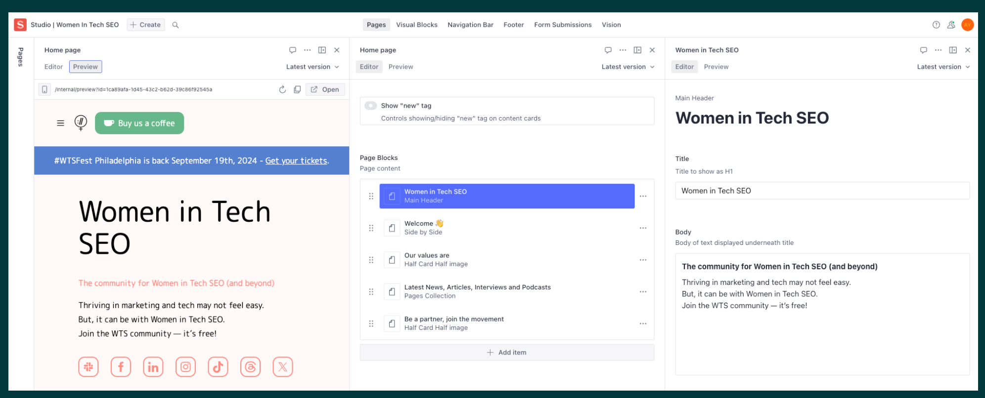
A screenshot of the content editing experience
Rebuilding the new Women in Tech SEO website was a reminder that basics done right are the heavy lifting.
There are more improvements we can do to the content editing experience that will make it even more easier that are all part of customising the Sanity Studio.

Amr Yousef - Software Engineer
Amr is Spaces & Tabs founder. With a BEng in Software Engineering and an MSc in Computer Science, it's fair to say he knows a thing or two about software. Over the past decade, Amr has built products for many big name brands and companies across Banking, Retail, Utilities, and Media Publication industries (to name a few). Passionate about building powerful digital products, Amr set up Spaces and Tabs to bring together a team of tech experts eager to create world-class software solutions.
